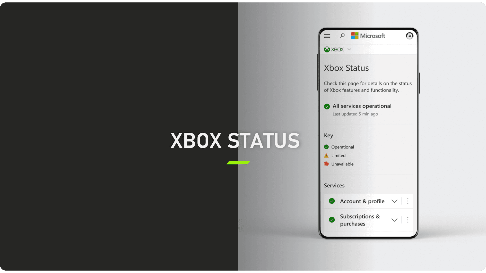
Xbox Status
The Xbox status page serves as a central hub for gamers, product partners, and studios to monitor incidents, outages, and maintenance events that impact Xbox systems, services, and 10K+ games developed by 1st party and 3rd party studios.
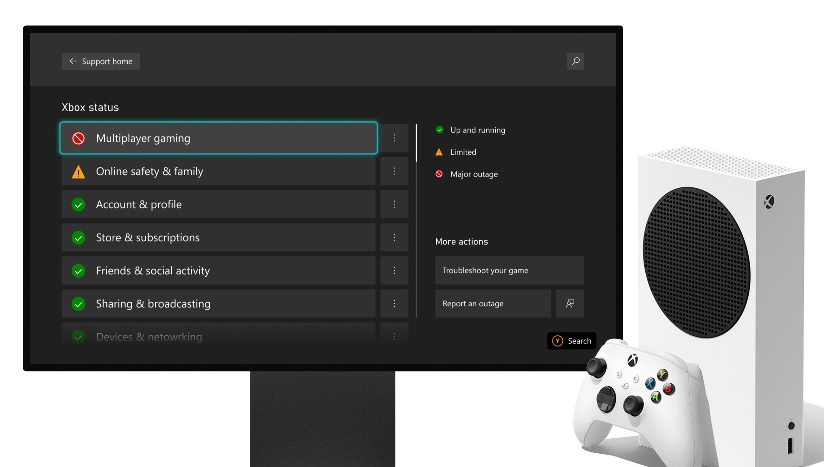
The goal of the status page is to report incidents across a range of modalities (Xbox console, mobile apps, PC, Web, and TV) and 42 countries. It is used by 120 Million+ active users to troubleshoot and resolve disruptions.
Xbox
Year
2019
Game Support
Product Design
Challenge
Altering a service with around ~100 dependencies wasn't a simple task; it would have led to accumulating a significant amount of engineering debt.
Additionally the service coverage felt incomplete, as the existing categories (like console, PC, mobile, and cloud) didn't quite encapsulate every customer experience (Cloud, Web, etc.) There was a mismatch between the messaging during incidents for customers and our public announcements, leading to confusion.
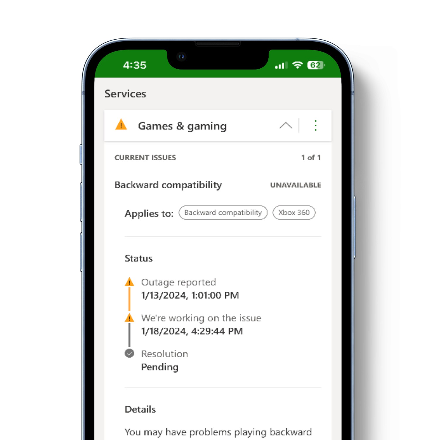
Furthermore, the incident reports needed improvement—they lacked details about new platforms customers used, such as iOS.
Results
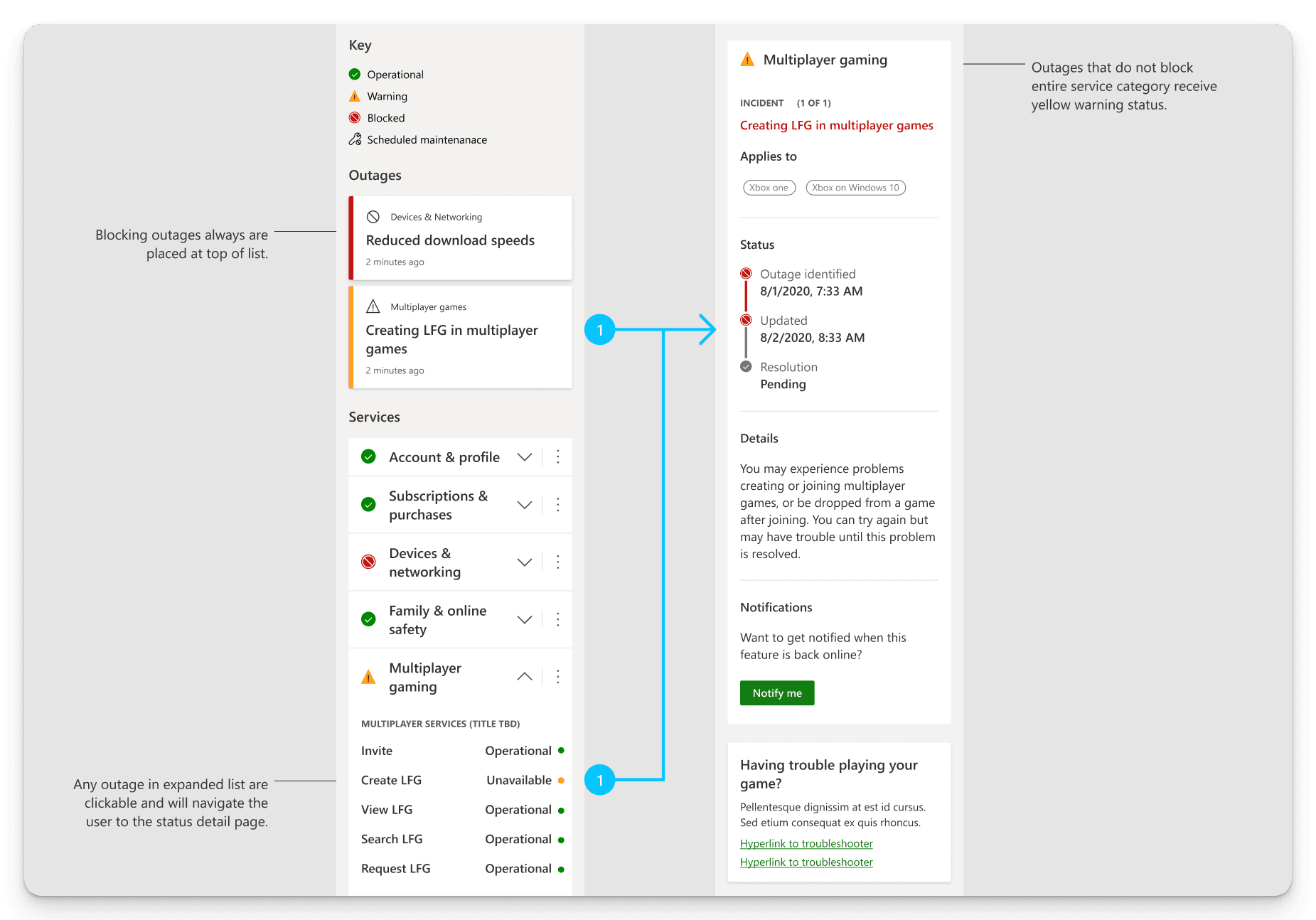
The redesigned status page features a clean, clutter-free user experience, with improved taxonomy that would allow for future categories to be ingested as the Xbox ecosystem grows.
The improved categories resulted in an 8 percentage points increase in customer problem resolution rates.
The addition of personalization and customization options enhanced user engagement, leading to a 25% increase in user retention rates.
85%
Improved UX/UI comprehension
79%
Increase in user category clarity
25%
PRR improved from 17%
Process
Research & Analysis: I began looking into existing research and our current competitor solutions. I discovered there needed to be more clarity in the UI of the Xbox Status page. Most participants in our studies needed help to parse the information they were being shown.
Information Architecture: Based on the research findings, we restructured the webpage content, prioritizing features and information according to user needs, like adding a status key to the page and prioritizing information to be disclosed when needed. Gamers could start at the initial set of information and, when necessary, move to the secondary set—exposing our hierarchical structure to the gamers rather than forcing them to discover it on their own.
Wireframing & Prototyping: We designed low-fidelity wireframes to visualize the new layout and navigation, iteratively refining them based on user feedback. Afterward, we built a high-fidelity, interactive prototype to test the design.
Usability Testing: We conducted usability tests with a diverse group of gamers to validate the design and identify areas for improvement. Based on the feedback, we made necessary adjustments to the design.
Visual Design: We developed a cohesive visual language, including color schemes, typography, and iconography, ensuring consistency throughout the eco-system.
"I think the red here means something is happening here, something wrong and needs attention, and green means everything is okay and no problem there."
Participant 1
Xbox Status Page Study
"It means something occurred that a problem stem from… an occurrence that created a problem."
Participant 6
Xbox Status Page Study


